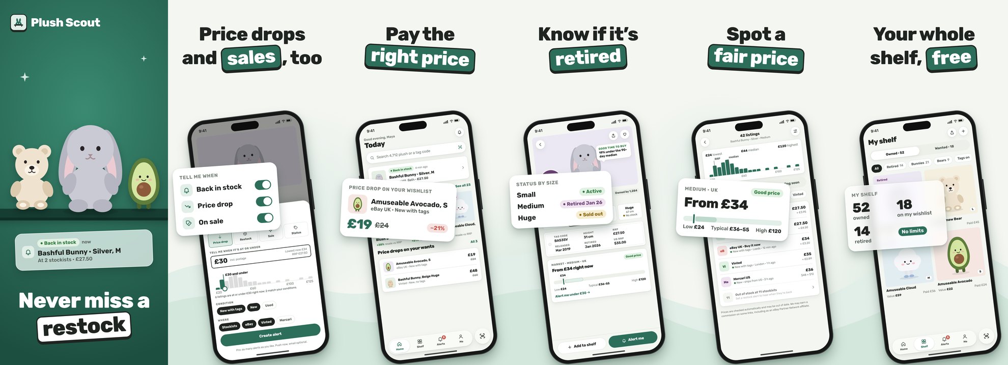
Austin Kleon's Steal Like an Artist makes a simple case: every new idea is a remix of old ones. Good artists don't copy one painting. They study many, learn a little from each, and make it their own.
Our first Plush Scout design had no references. We described what we wanted and took what came back. It worked, and it looked like nothing in particular.
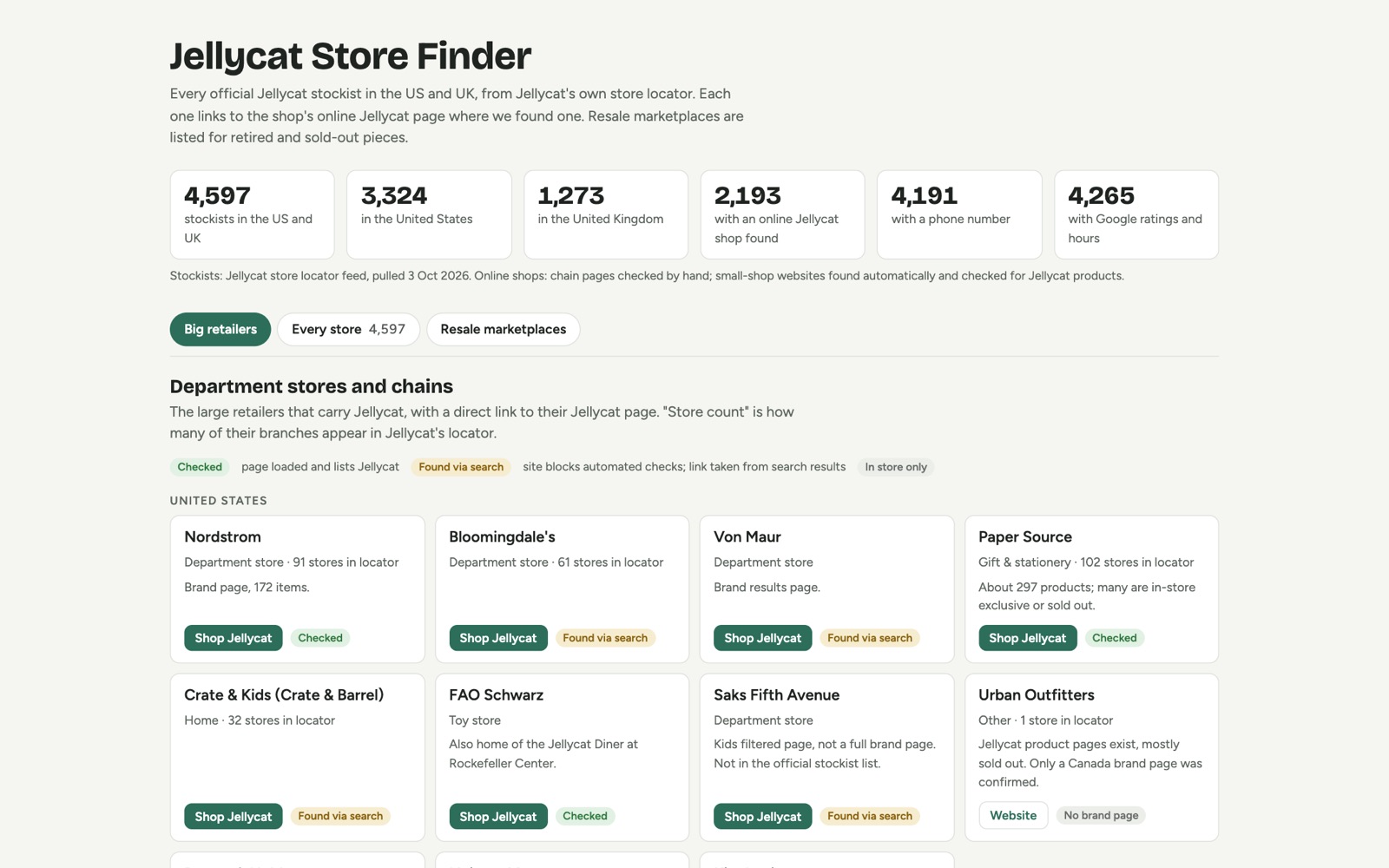
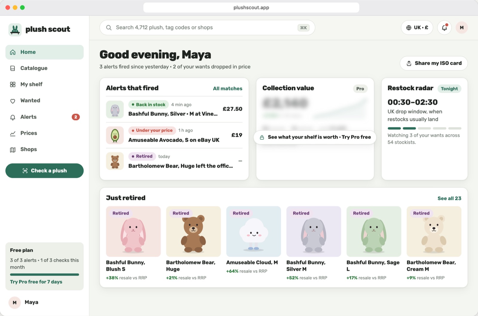
So now we start from references on purpose. Our library is Mobbin, a searchable collection of screens from real, shipped apps. The trick: search for the job a screen does ("price alert", "free trial", "wishlist"), not for an app to clone. Then learn from it in four moves.
Learn from layouts.
A layout is a solved problem. Someone already worked out how to show a price verdict, a wishlist or an alert. Use the structure, draw your own skin.
- KlarnaA product page with store offers and a price verdict → our plush page
- GOATOwned and Wanted on one toggle → our shelf
- MindtripThe "Set up price alert" sheet → our alerts
- eBay"Recently sold" prices → recent sales
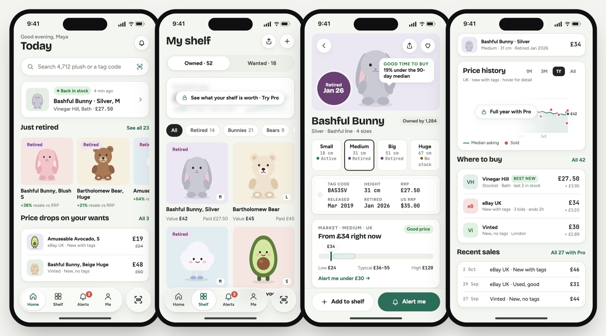
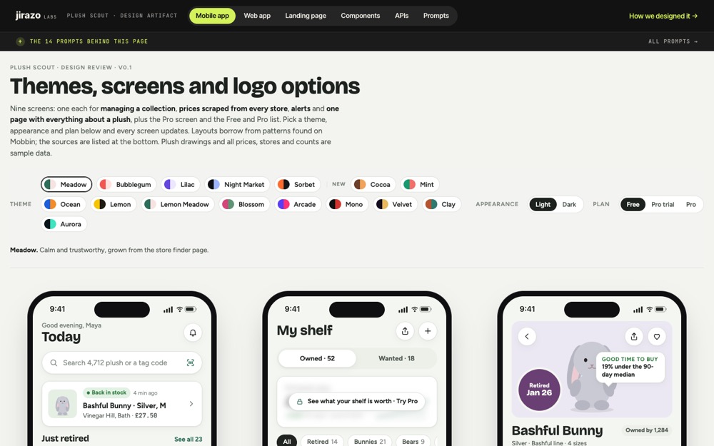 Mobile app →9 screens, with every Mobbin source listed
Web app →7 desktop screens from Perplexity, Zillow, H&M and more
Learn from themes.
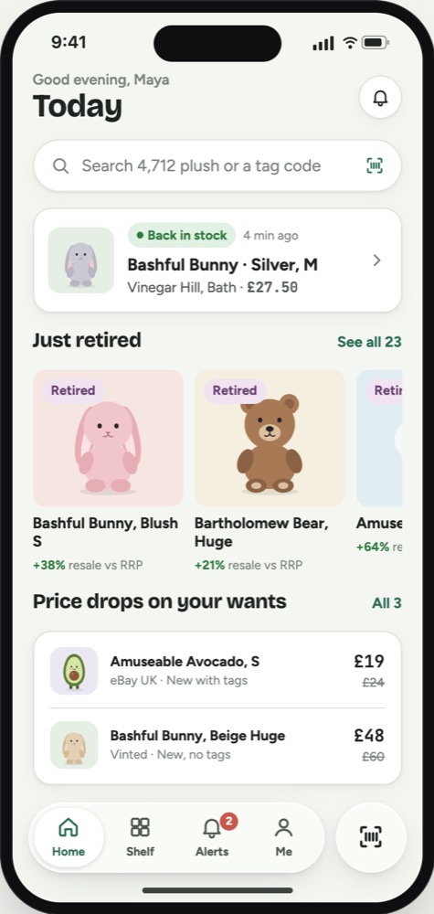
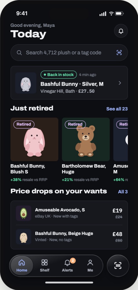
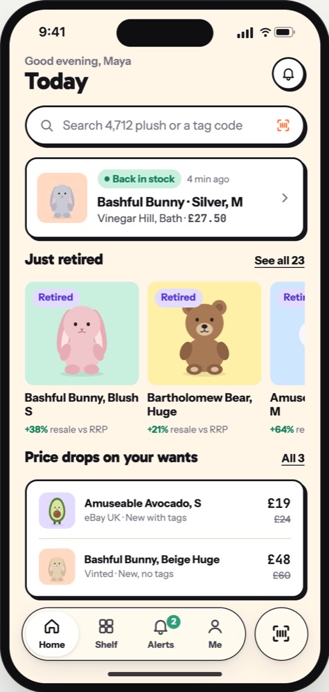
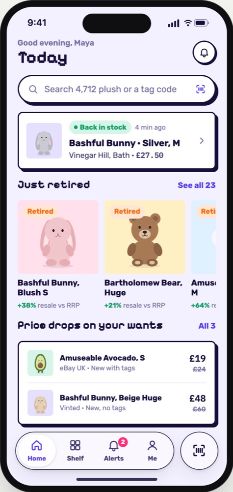
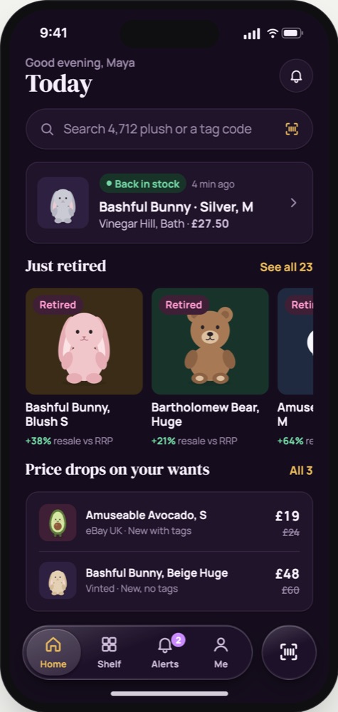
Colour, type and corners carry a mood. Instead of picking colours from thin air, each theme takes its cue from an app that already nails it. Every theme restyles every screen at once, so we chose by looking, not by arguing.
- StockX · GOATNight Market: dark and data-dense, like a resale market
- Hopper · FinchBubblegum: soft, round and giftable
- WhatnotLemon: bright buttons for drops and restocks
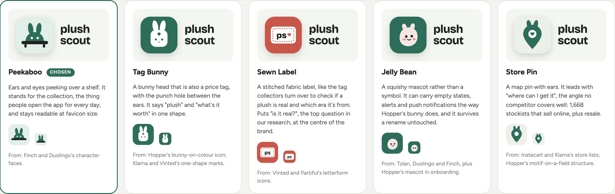
- Finch · DuolingoPeekaboo, our logo: a friendly face peeking over a shelf
Learn from components.
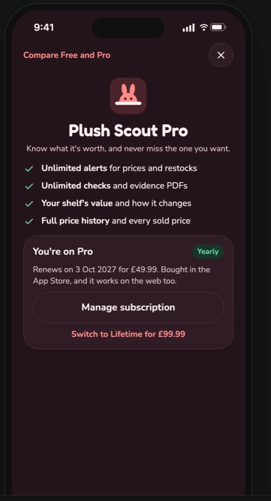
Components are where the details live: a paywall, a membership card, a tab bar. Our first Pro screen was a list of ticks, and the review note was four words: it doesn't look good
. So we studied apps with great subscription screens.
- StardustThe free trial as three dated steps
- PublicA membership card with "Member since", once you're Pro
- CleoA plan comparison that only lists what's different
- Revolut · FlightyGlass only on the tab bar and floating buttons; content stays solid
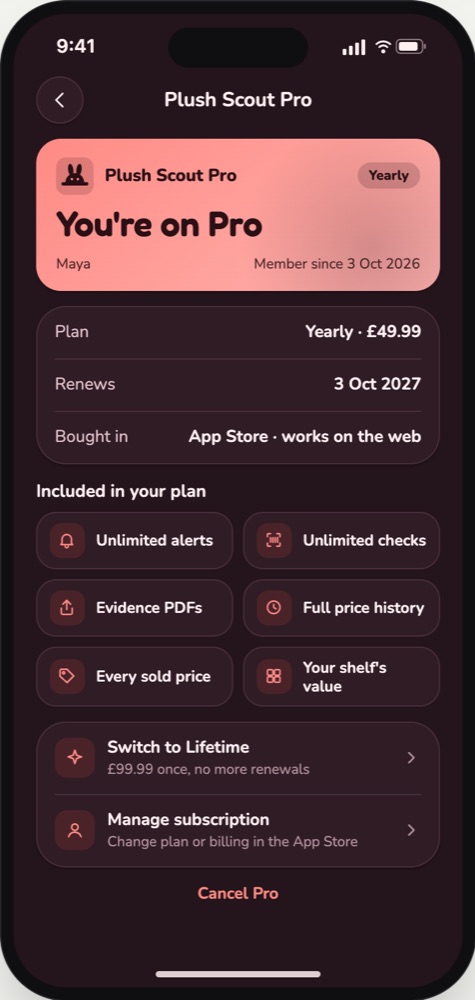
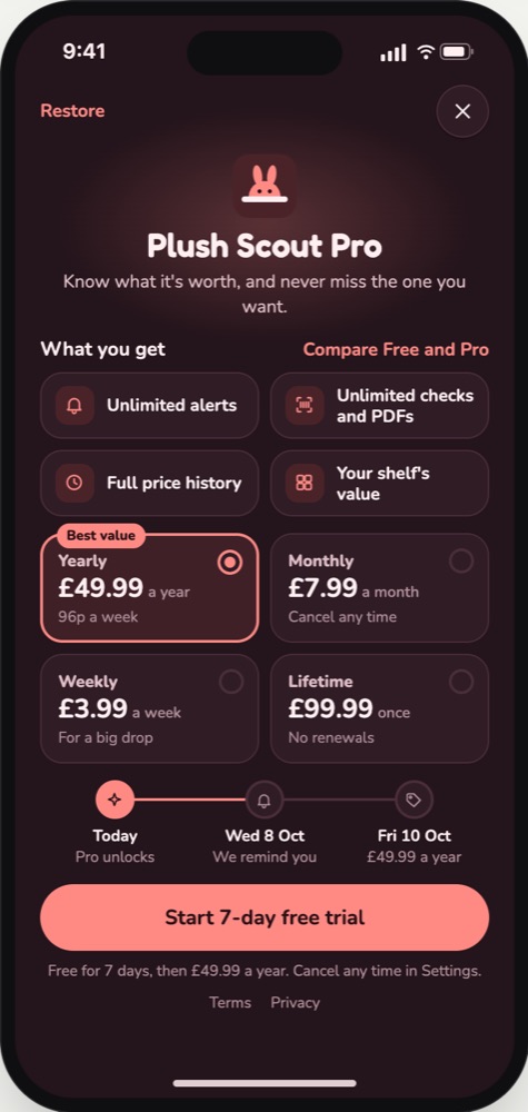
Learn what the reference actually does. When we first asked for Liquid Glass, everything turned to glass. Revolut and Flighty only use it on the tab bar and floating buttons; content stays solid. A quick look back at the source fixed it.
Those pieces then turn into a build list: 72 components for one Expo app on iOS, Android and the web, and the 47 APIs the screens call.
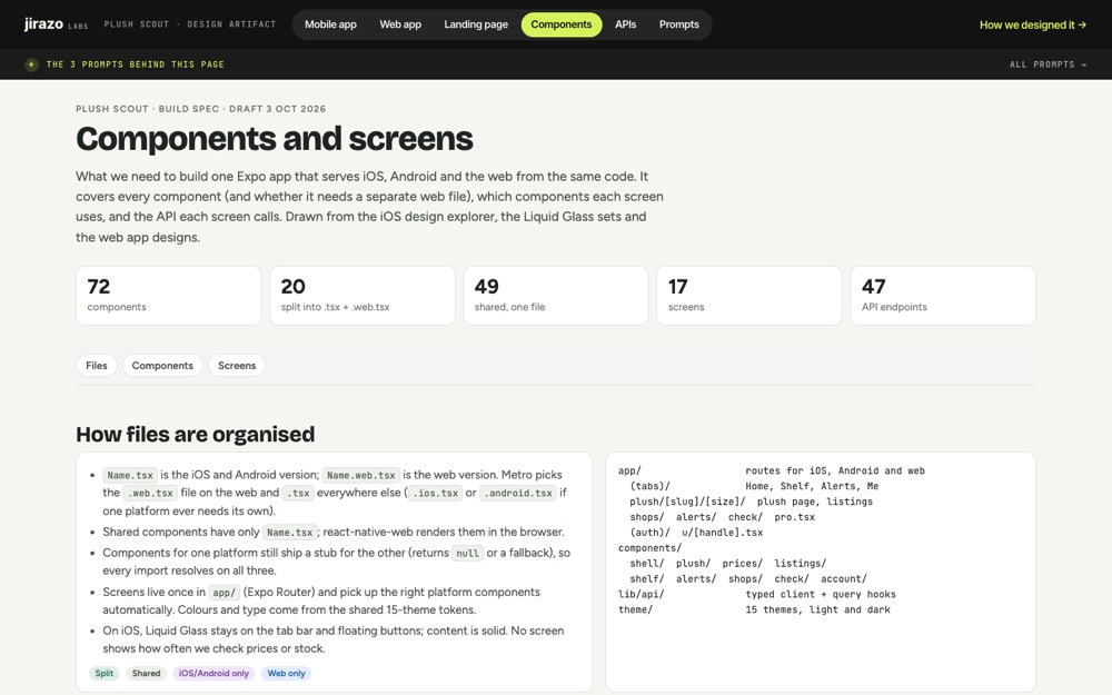 Components →72 components and which screen uses each
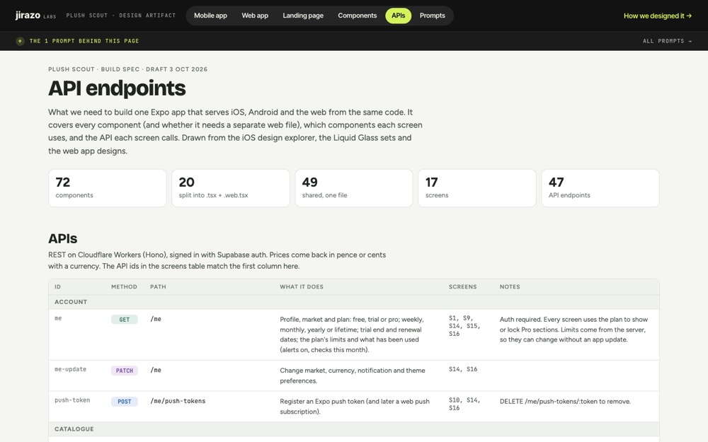 APIs →47 endpoints, mapped to the screens that call them
Merge them into something new.
Copying one app is copying. Learning from many and merging them is design. Every landing page option for plushscout.com merged three or four references into one page. Each name links to its Mobbin section:
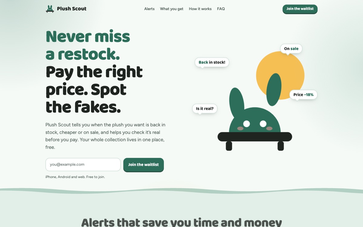
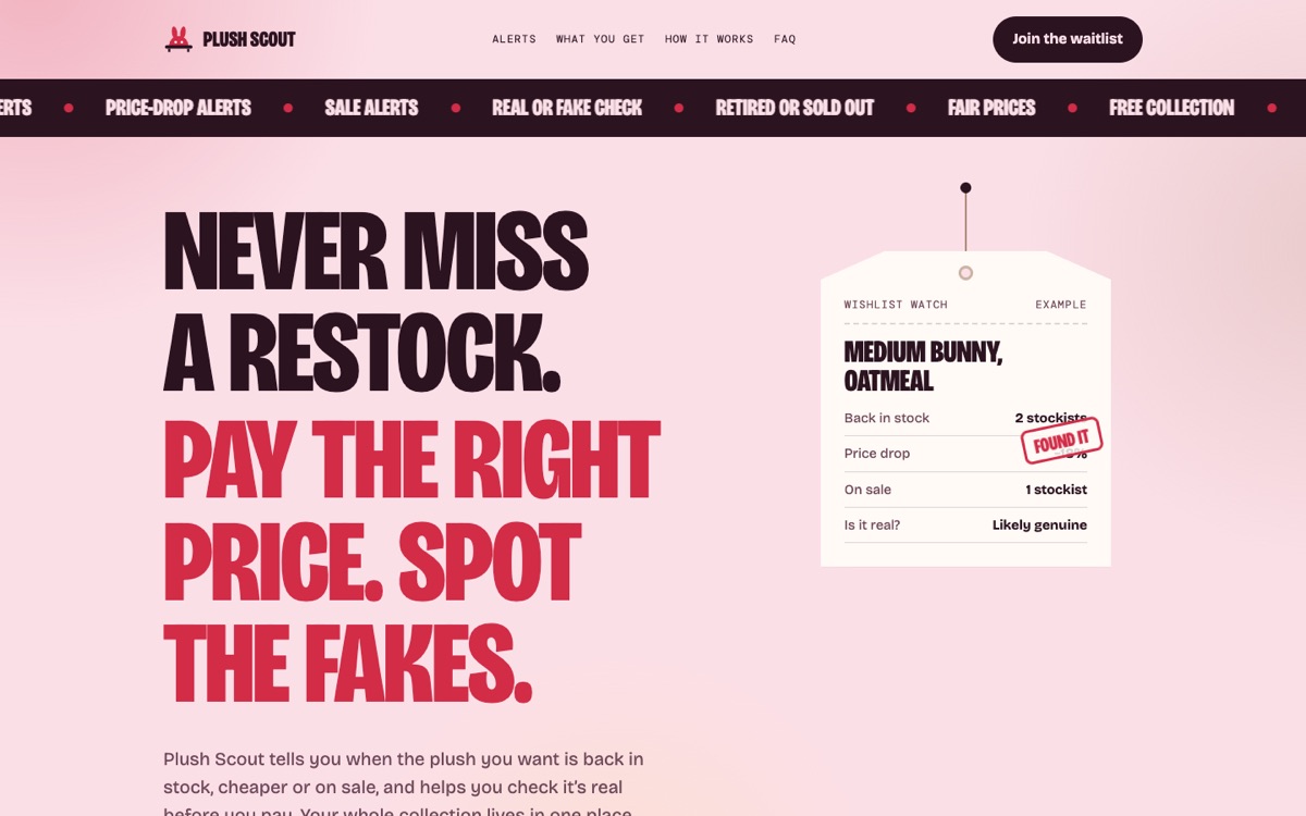
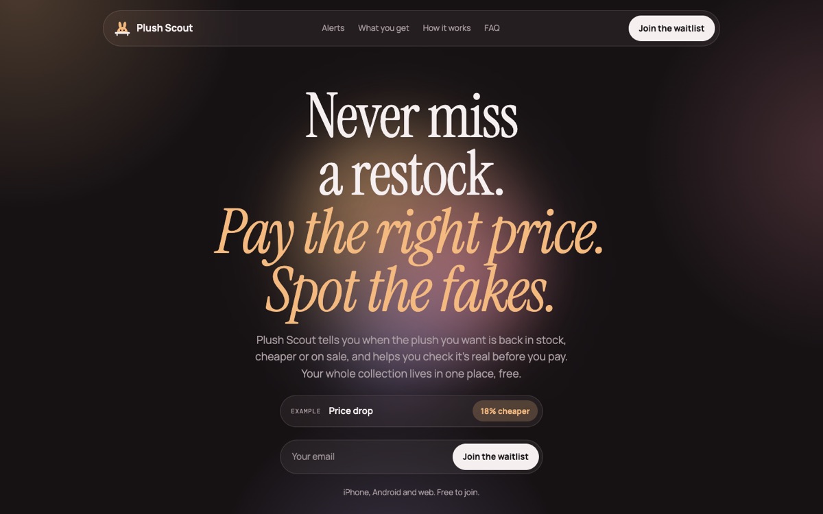
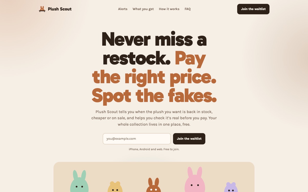
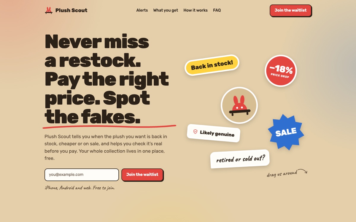
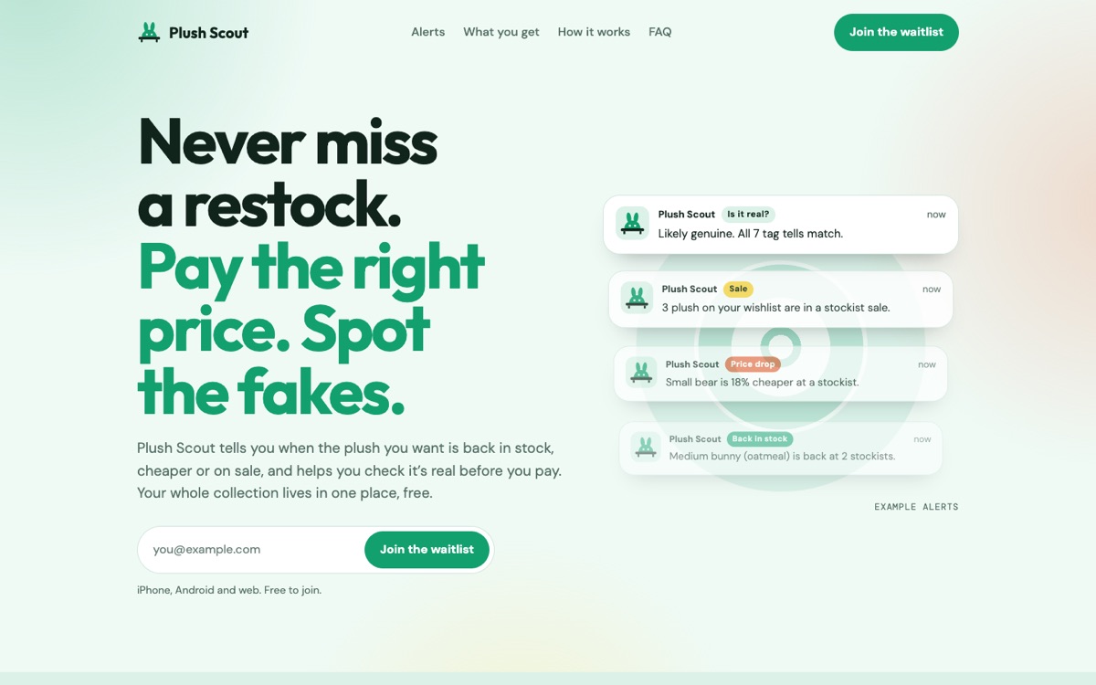
We merged words the same way: the same page in four voices, compared line by line.
- Clear benefits"Never miss a restock. Pay the right price. Spot the fakes." Picked
- Collector to collector"Your ISO list, on watch for you."
- Problem → fix"Sold out again? We'll tell you when it's back."
- Short and punchy"Find it. Check it. Keep it."
The final merge was F · Ping's layout, the Mint theme, a grain background and Clear benefits copy. That's plushscout.com. Our own site is a merge too: Cloudstudio's playful mascot, a one-line promise, and a logo whose j and i dots are eyes.
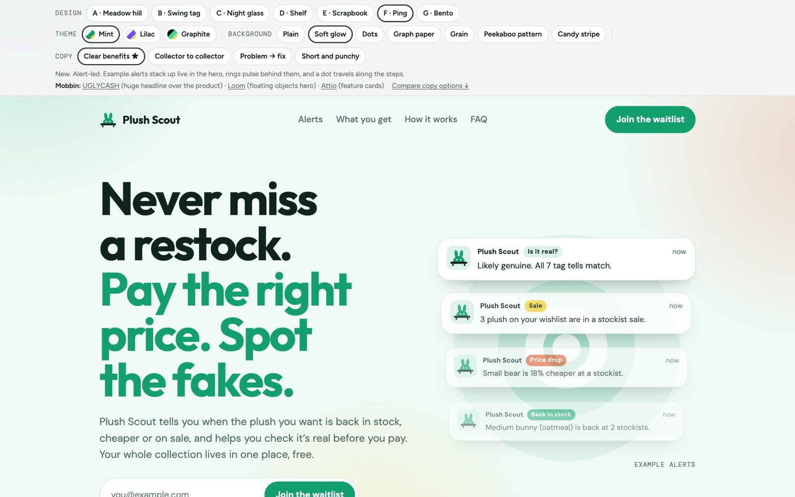 Landing page options →7 designs, 3 themes each, 4 copy voices, all switchable
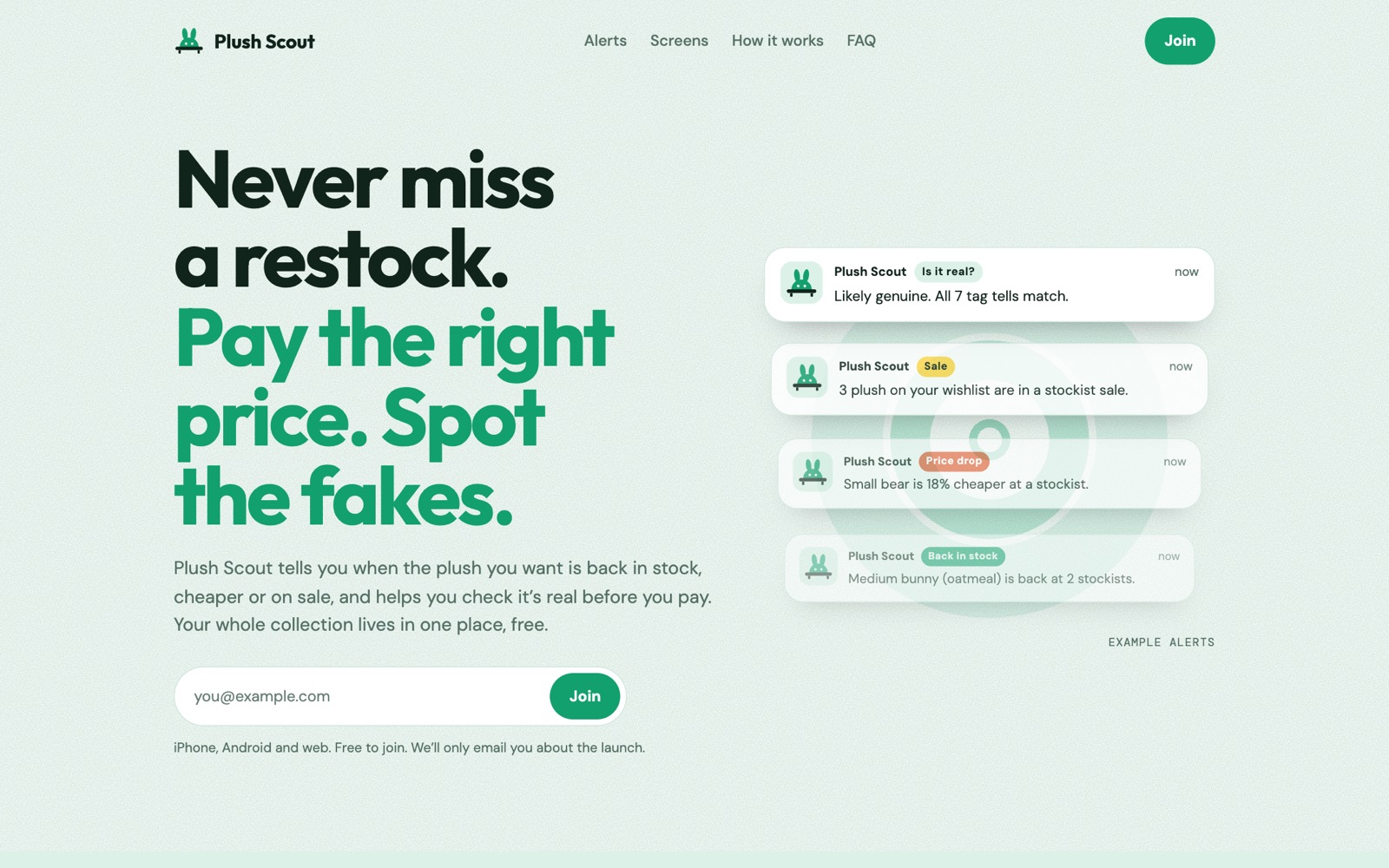 plushscout.com →The merged result, live
Learn like an artist, in four lines.
- Search the job, not the app."price alert" finds better ideas than "apps like StockX".
- Learn one thing from each reference.And write down where it came from.
- Learn what the reference actually does.Not what you remember it doing.
- Merge many, then make it yours.Your drawings, your colours, your words.